WEB DESIGN | PERSONAL PORTFOLIO | ARCHITECTURE
CLIENT:
Personal portfolio – Architetto Antonelli
BRIEF:
I was asked to design a personal to show personal architecture projects , also to . His use of colors and his way of understanding architectural design. a website in which to clearly evoke a style of designing.
Personal portfolio – Architetto Antonelli
BRIEF:
I was asked to design a personal to show personal architecture projects , also to . His use of colors and his way of understanding architectural design. a website in which to clearly evoke a style of designing.
ART DIRECTION:
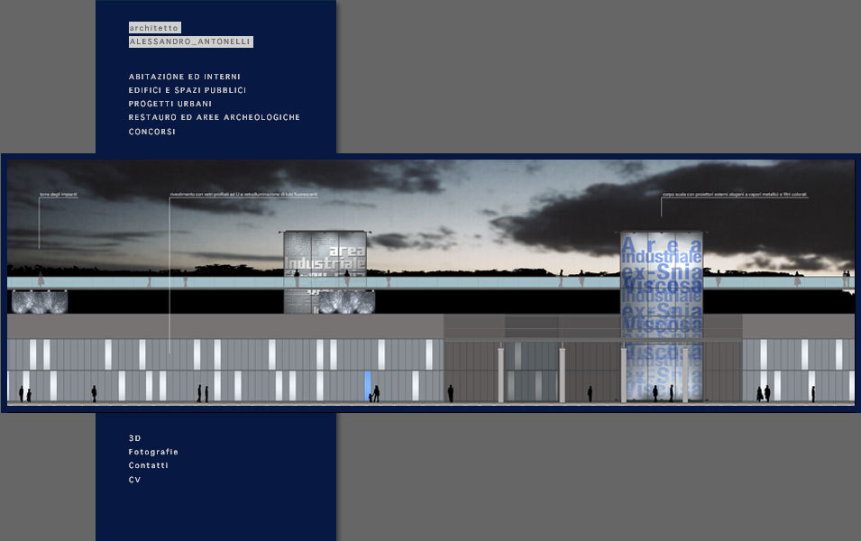
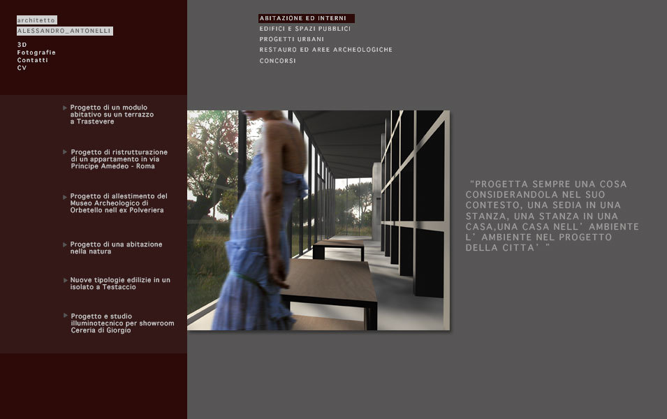
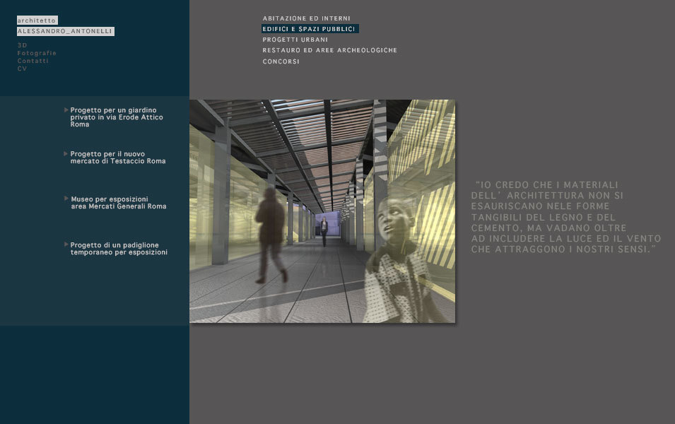
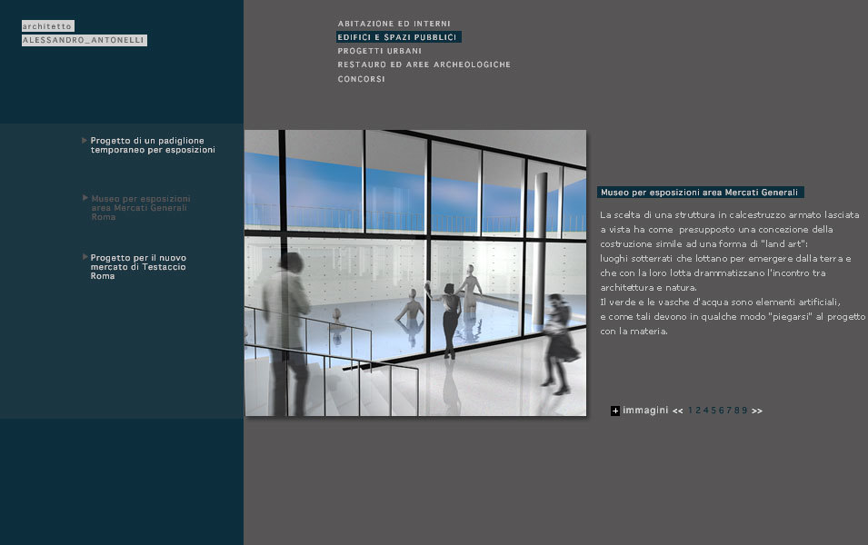
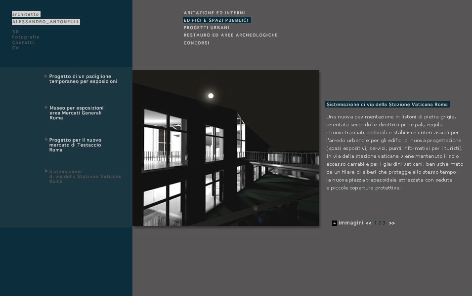
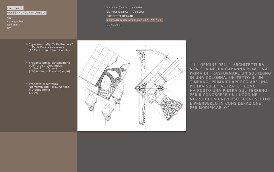
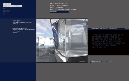
My idea was to have a very basic portfolio with little touches that speak to the architect. The use of colors to differentiate the sections. Key phrases. Lots of well crafted renderings.A usable but elegant structure. “Less is more” is the architect’s favorite phrase (Mies Mies van der Rohe).
INTERFACE DESIGN:
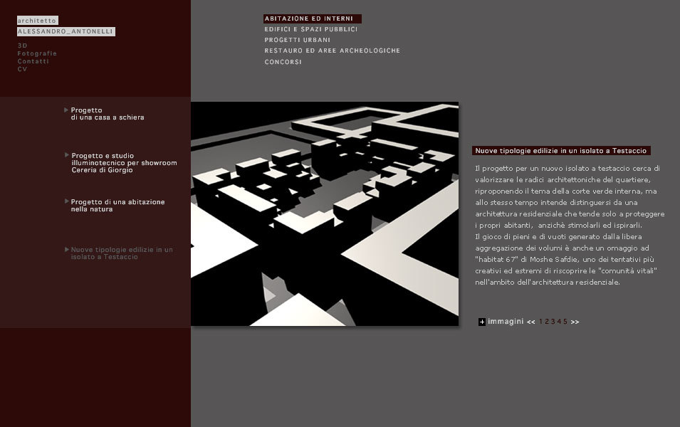
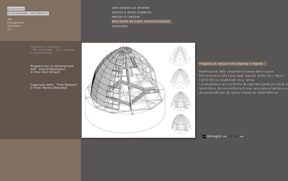
Each project then has its own gallery. You can easily view all the content.
+ CONCEPT:
There is always an introductory section with a collage of evocative 3D images and a key phrase about architecture. Each project then has its own gallery.The result was a portfolio that was easy to navigate but elegant and full of personality.Objective achieved and architect satisfied.


