WEB BRANDING | WEB DESIGN | ISTITUTO CENTRALE BANCHE POPOLARI | BANK
CLIENT:
Istituto Centrale Banche Popolari Milano
The institute had an image that was a bit old and needed to be renewed in a key of greater modernity oriented towards innovation.
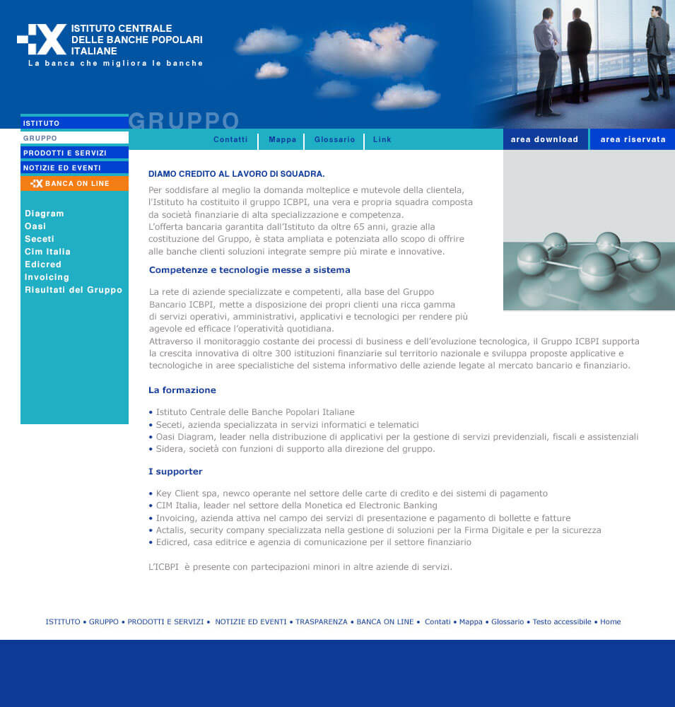
To represent an interconnected network of professionalism. A solid and reliable group. Unique entity but also network of specialized companies. ICBPI represents a complete
offer to satisfy the entire financial market. There are two souls: Banking and Institutional (values and symbols). Technological and Market (competitiveness, innovation, customer orientation)
ART DIRECTION:
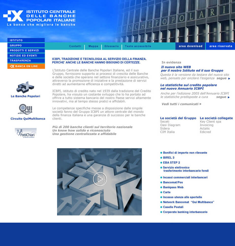
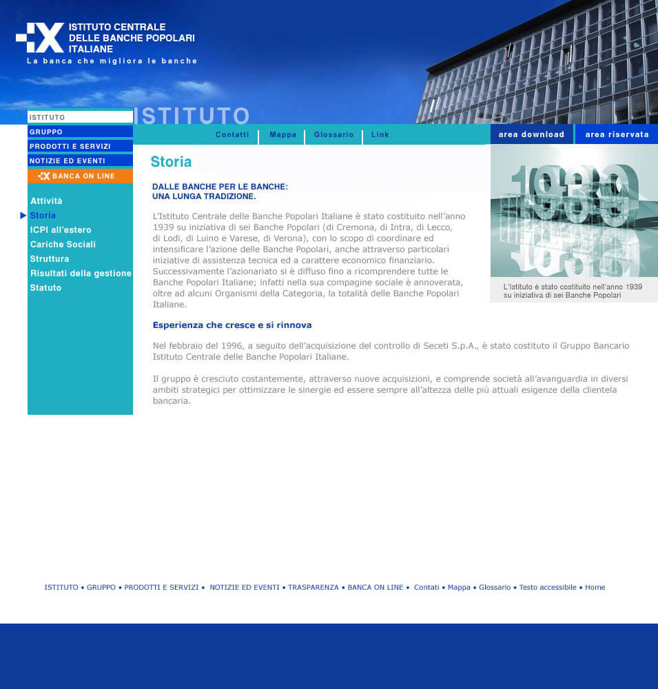
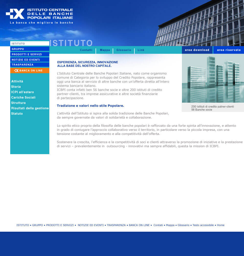
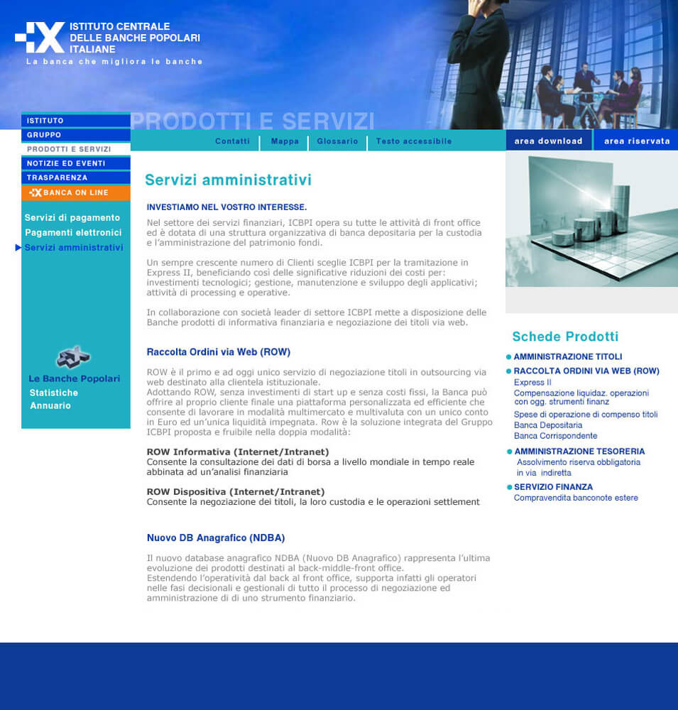
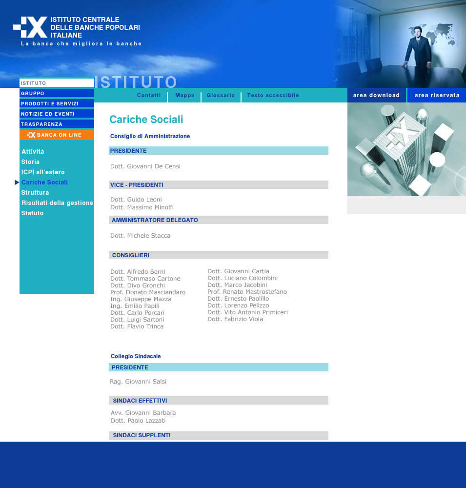
Next to ICBPI building (icon) I have inserted a second element : the sky. I meant to render the concept of technology and tradition, transparency and dynamism, perpetual flow.
The metaphor of the sky also stems from the need to illuminate the blue of the old website, passing through the cyan here is that the bright but transparent blue of the sky harmonizes and makes sophisticated the tone of communication. There is a human presence, always present. Also female, dynamic but welcoming.
INTERFACE DESIGN:
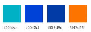
The interfaces are simple, clean, but also through the images we want to give a very technological image, sophisticated but also reassuring, of great confidence. Sections are easy to identify and well differentiated in the header. The text is of a sufficiently readable body but in gray color to make the whole light and invite reading I added to the institutional color, dark blue, a new color, turquoise had the task of illuminating and making the dark blue more electric and innovative.
+CONCEPT :
inside the sections there are representations through 3D graphics of the key topics of the section, to make the text more interesting and readable. The 3D graphics were created specifically for the site. They underline competitiveness, innovation, customer orientation.

