WEB DESIGN | CILMEMULTITEL | E - BANKING
CLIENT:
Cilmemultitel
IT company that dealt with telematic services and payments for the popular banks group
BRIEF:
The leading e-banking company didn’t have a website yet.You had to interpret their Technological soul without making it too cold a site. Need to have a B2B website,
so they were selling payment services to banks and companies.
ART DIRECTION:
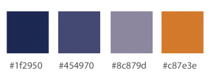
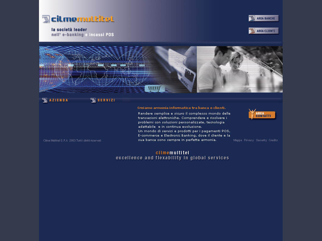
In the home page I visualize the double vocation of Cilmemultitel with a technological illustration of a posse in action juxtaposed to a photo of a couple happily shopping in a store. The background color is the institutional blue together with orange inserts like the logo. Photos have formal style but never banal
INTERFACE DESIGN:
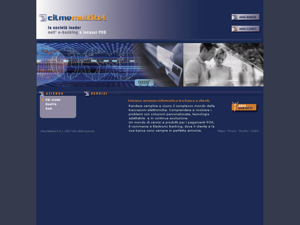
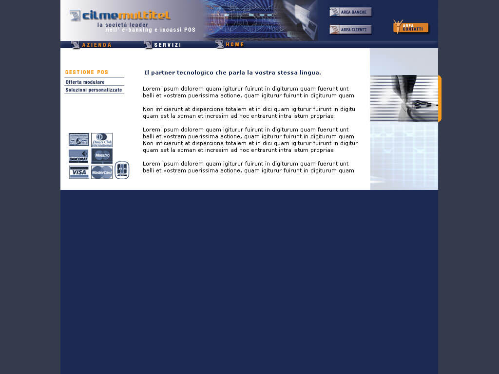
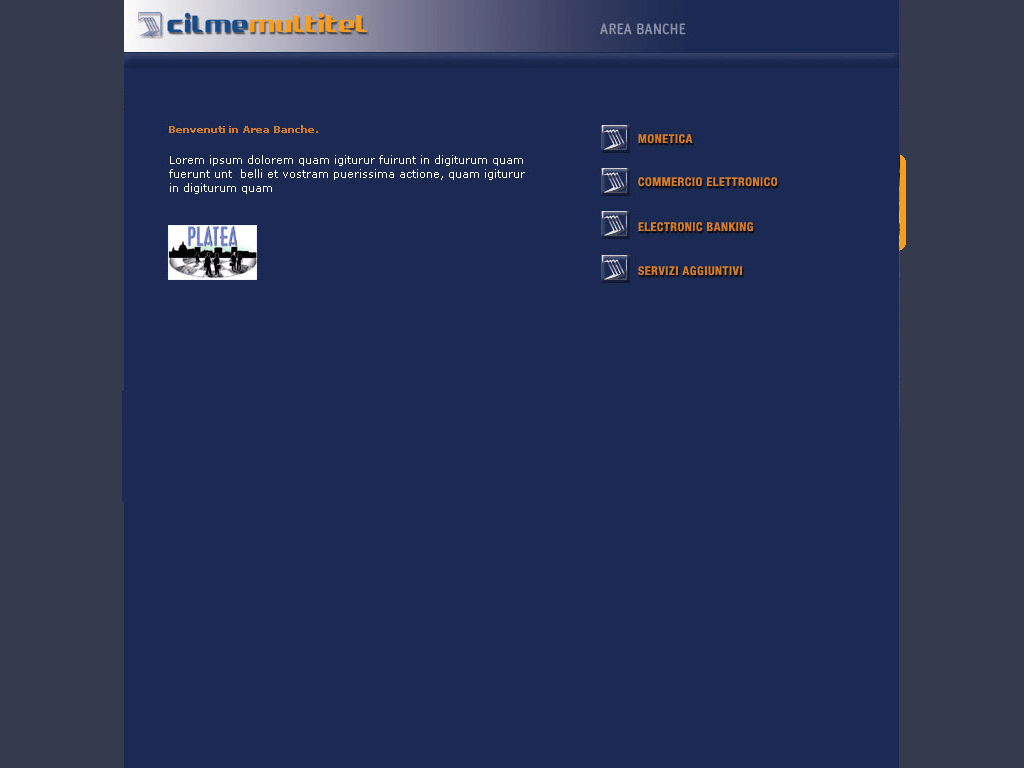
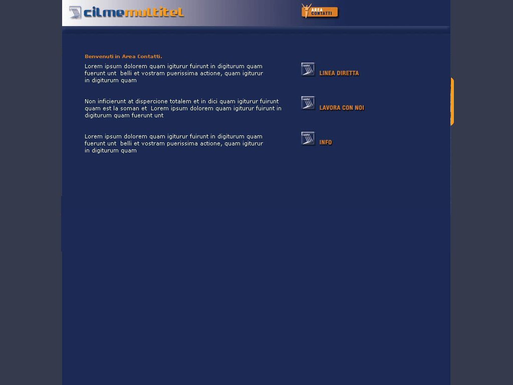
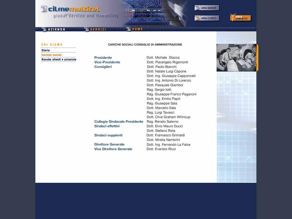
The banner at the top contains the logo, the buttons to access the areas and the menu of the first level.The menu of the sections is on the left. The site is basically divided into 3 sections.The institutional section with all the info about the company. The area dedicated to banks with very simple templates for the various operational functions. The reserved area which is accessed with user and password and allows to carry out specific functions.
+ CONCEPT:
The important part is to make the steps of the various functions usable and simple since then the site provides services to banks and each button must be hooked to the real computer part.
