WEB DESIGN | FONDO BANCHE E ASSICURAZIONI | CONTINUOS TRAINING
CLIENT:
FondoBanche e Assicurazioni
BRIEF:
The institutional connotation also had to have a visual language and a tone of voice that was operational, simple and captivating, not bureaucratic. To be close to the needs of daily contact with all training operators and companies in the sector.
ART DIRECTION:
The need was to accompany the birth of the Fund with a strong institutional identity on the Web in order to position it as a reference point for continuing education of the national banking and insurance system towards generalist and specific targets.
INTERFACE DESIGN:
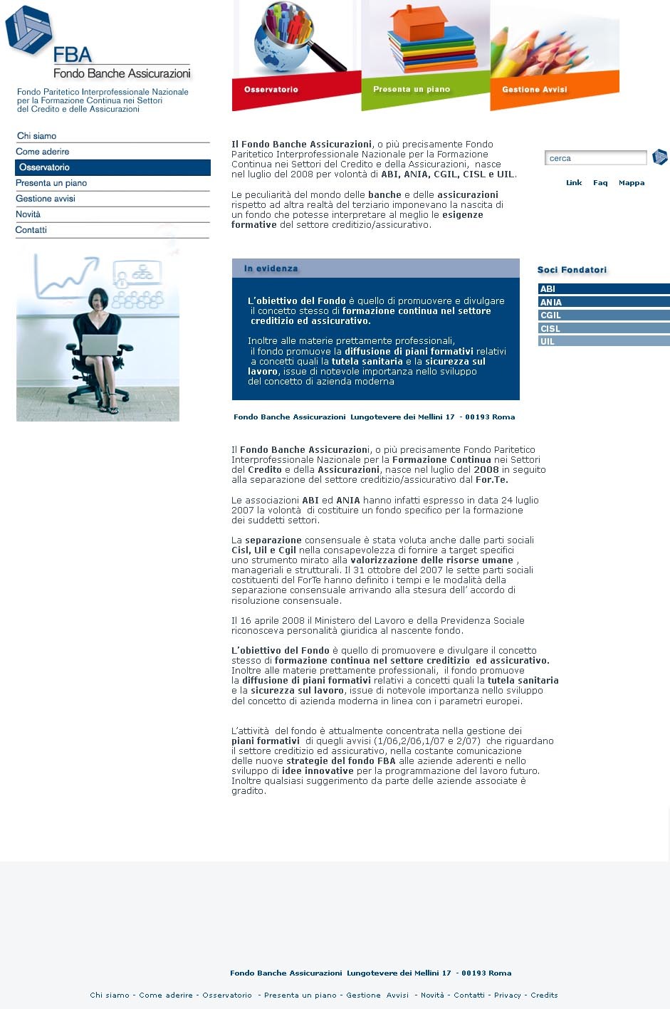
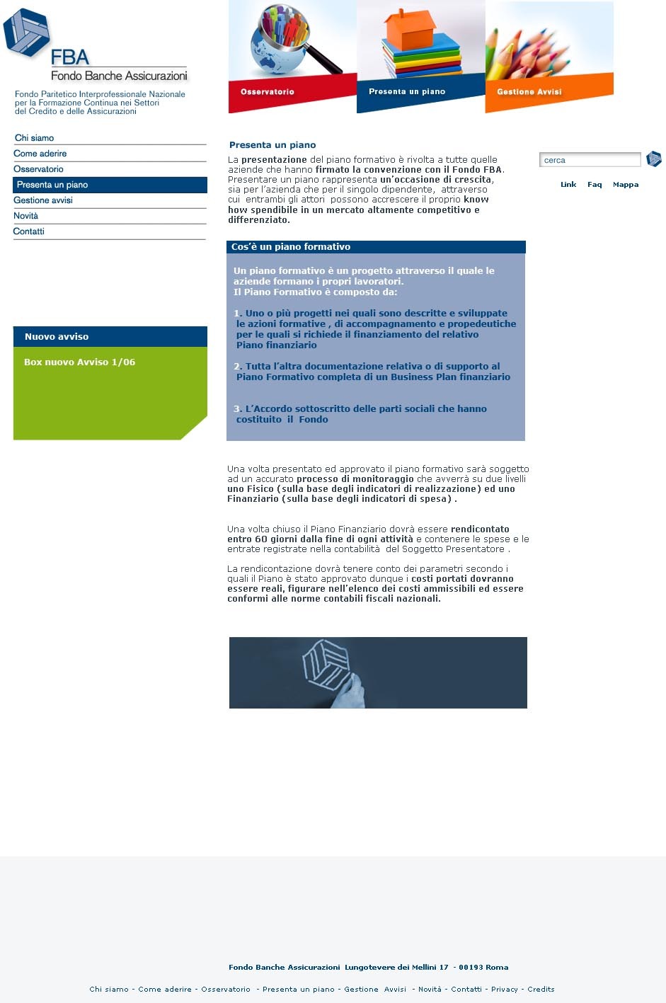
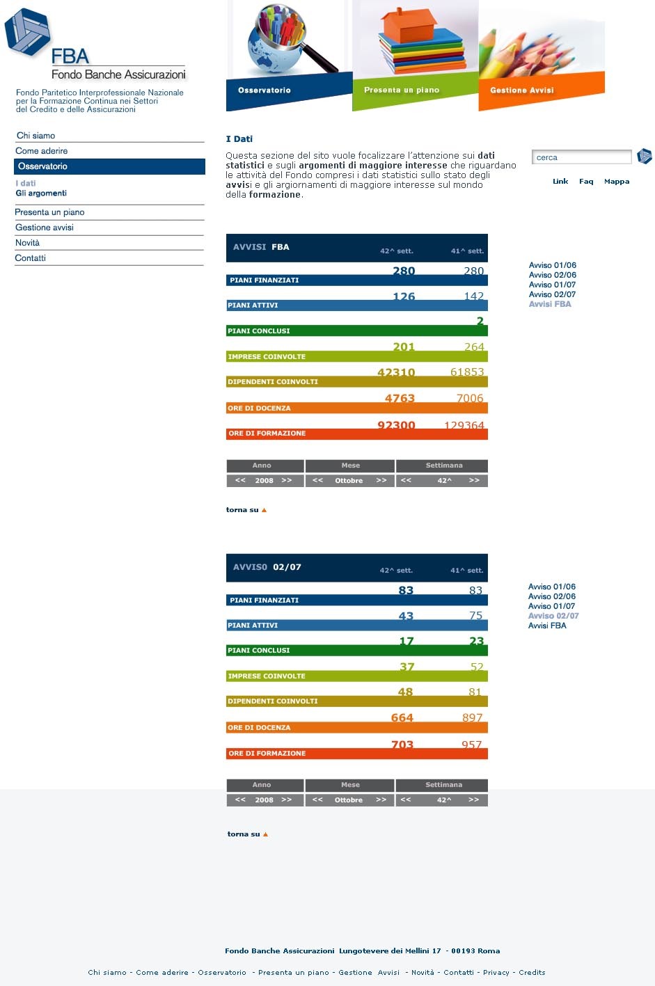
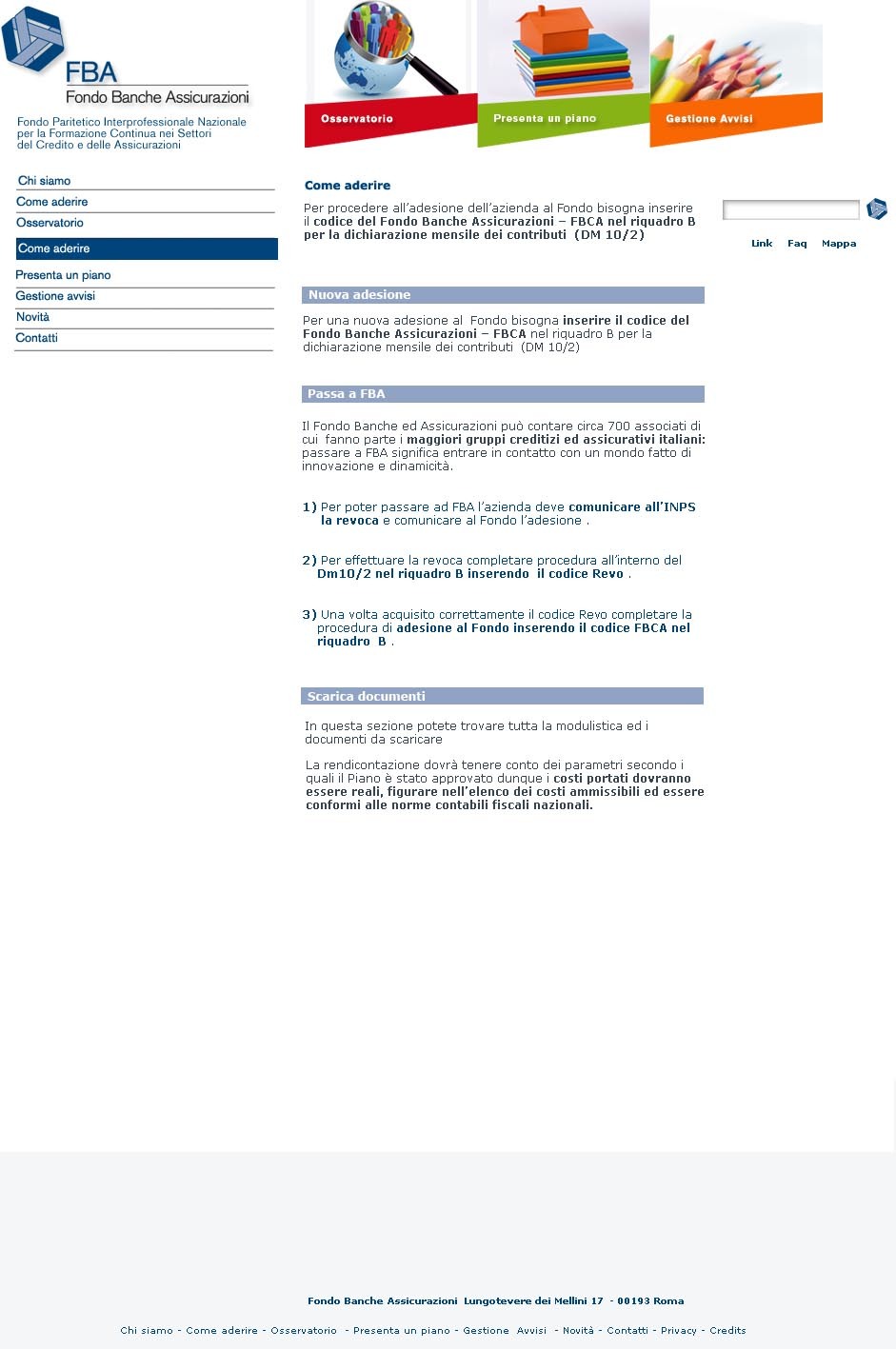
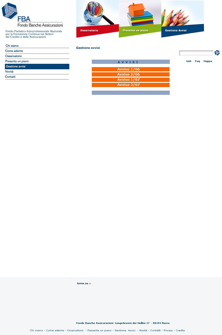
The interface is deliberately simple so that the user can reach the information in the shortest time possible.The 3 main sections are well in evidence and constitute the visual element of the site.The outlines are asymmetrical in contrast to the simplicity of the images. On the left the first level menu. The colors play a fundamental role in making the contents evident and interesting.
+ CONCEPT:
FBA – Fondo Banche Assicurazione is the largest joint interprofessional fund for continuous training in the Italian banking and insurance sector.The purpose of the site is to simplify the search for available content and make it available in as few clicks as possible to the user. Less is more.


