WEB DESIGN | FINNAT PRIVATE BANK | FINANCIAL SERVICES
CLIENT:
Banca Finnat Euroamerica private banking
BRIEF:
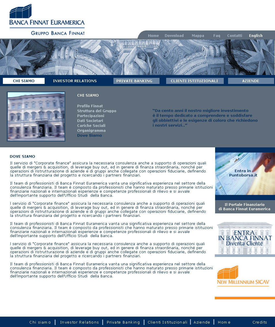
While the prestigious headquarters of Palazzo Altieri exalts the tradition and exclusive elegance of Banca Finnat, it does not fully represent its true identity, the one built by the people who work for Finnat and nurtured every day by their
projects: skilful movements on the financial markets, advice at the highest level, reliability and competence.
ART DIRECTION:
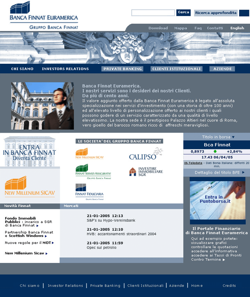
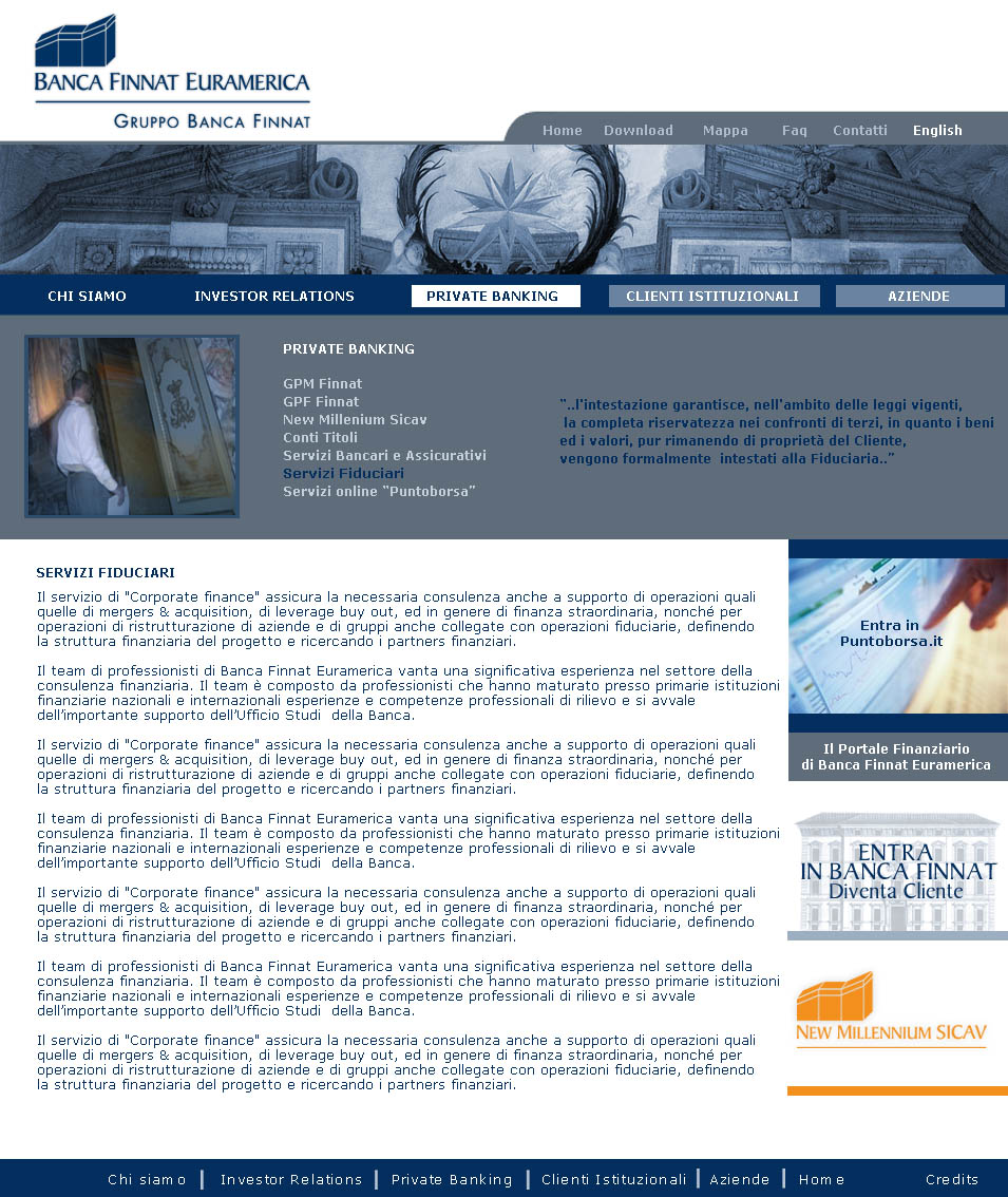
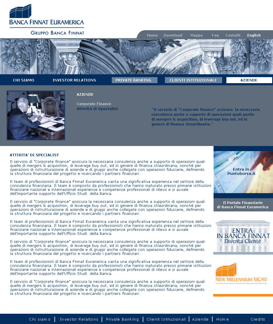
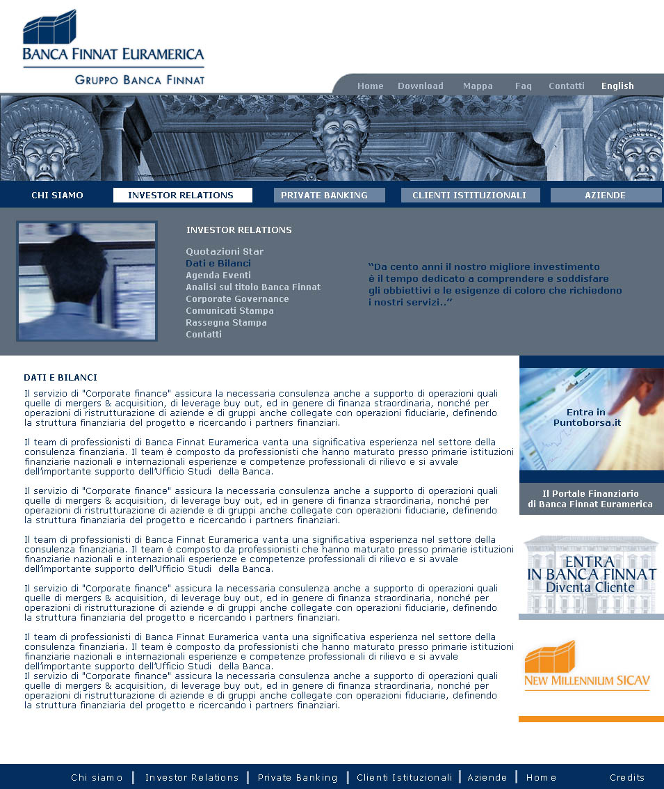
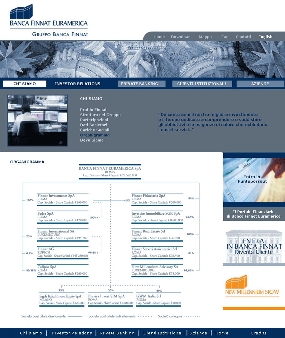
I have made more graphic and modern use of frescoes that become almost a monochrome texture. Banners characterizing the theme of the sections. Inserted the “human touch” through people, who change depending on the section. I have chosen to represent the work team, juxtaposing the frescoes of the palace and assuring
to Finnat an image built on the iconic prestige but inseparable from the quality of the people who work there and of the services offered and personalized.
INTERFACE DESIGN:
The structure, at least in the homepage, is portal-like. The colors are the institutional ones: blue, made more electric to not turn it off too much on the screen, and gray. There are always some titles that synthesize and communicate at first sight the topic of the section.
+ CONCEPT:
In restyling the site, the client asked to combine their prestigious history, iconic location with the efficiency and very high level of their financial services.The phone call with the customer, the signing of a contract, the glance at the stock exchange, Finnat’s efficiency.


