WEB DESIGN | BUILDING FUND ROME AND PROVINCE | CONSTRUCTION WORKERS
CLIENT:
Cassa Edile Roma e provincia
BRIEF:
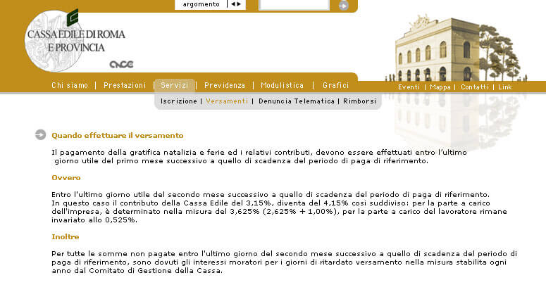
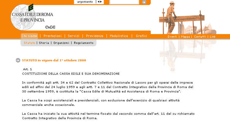
Restructuring of the content flow of a website of at least 80 pages. The goal is to try to make the navigation very intuitive, making the site a service site easily accessible but also attractive and elegant. Having clear templates design for each section.
ART DIRECTION:
To build beauty and consequently to create well-being for workers and inhabitants, on the other hand to represent the image of Rome and then the building fund as a city innovative, elegant and cultured.
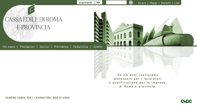
Collage illustration of a city a bit ‘metaphysical but of great charm, formed by works really cared for by the Cassa Edile and great prestige for the city of Rome, which reflects its beauty as if it were a mirror.Background is white as a sign of cleanliness rigorous technology well-being, the sections instead have bright colors to be identified easily.The istitutional color is green.
INTERFACE:
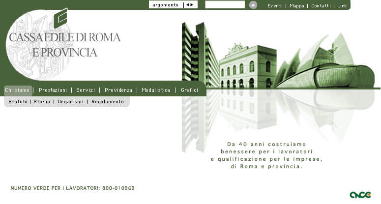
UI is simple and powerfull. Menu is designed in such a way as to allow the immediate understanding of the topics, and thanks to a dropdown containing the specific subheadings of the topic you can easily find what you are looking for avoiding annoying Chinese boxes. Possibility to find the desired topic from the first page,so here is the space to enter keywords and the search on all topics covered in the site.Under the ideal city (the checkout) the free toll-free number for jobs pops up, which once again highlights the care and willingness to assist of the building fund.
+CONCEPT:
everything that is built in a city like Rome must compete in beauty, elegance and culture.


