WEB DESIGN | EDICRED CREDIT PUBLISHING | BANK COMMUNICATION
CLIENT:
Edicred Credit Publishing
The company acts as a publishing house at the service of the “central system of popular banks” and its “individual actors” (central bodies, banks) to meet all their publishing needs.
BRIEF:
Prepare to face, in an original and competitive way, the “open”, publishing and communication market
increase the visibility of the company within the banking system
Communicate and make attractive its own offer system
overcome the communication gap between the current corporate image (publishing house) and the positioning objective.
ART DIRECTION:
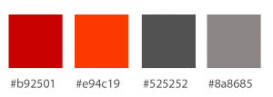
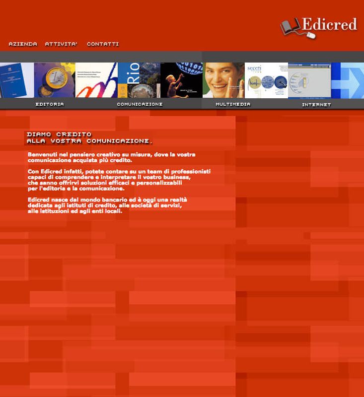
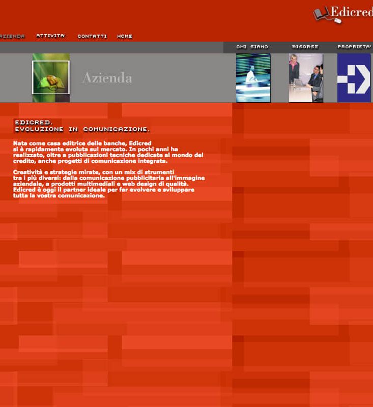
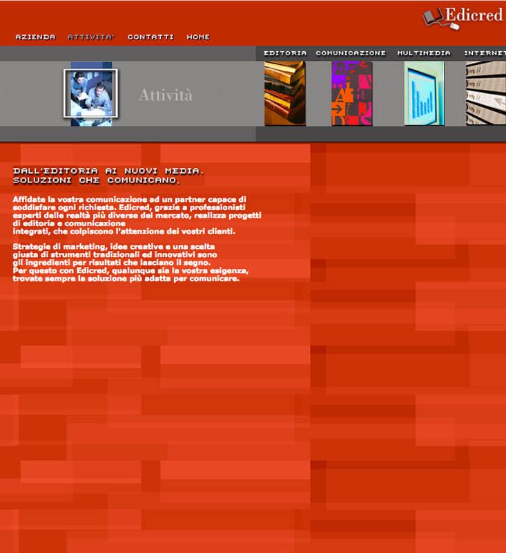
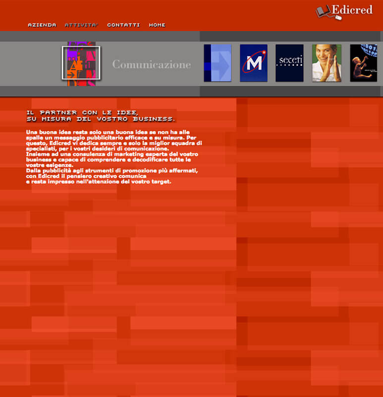
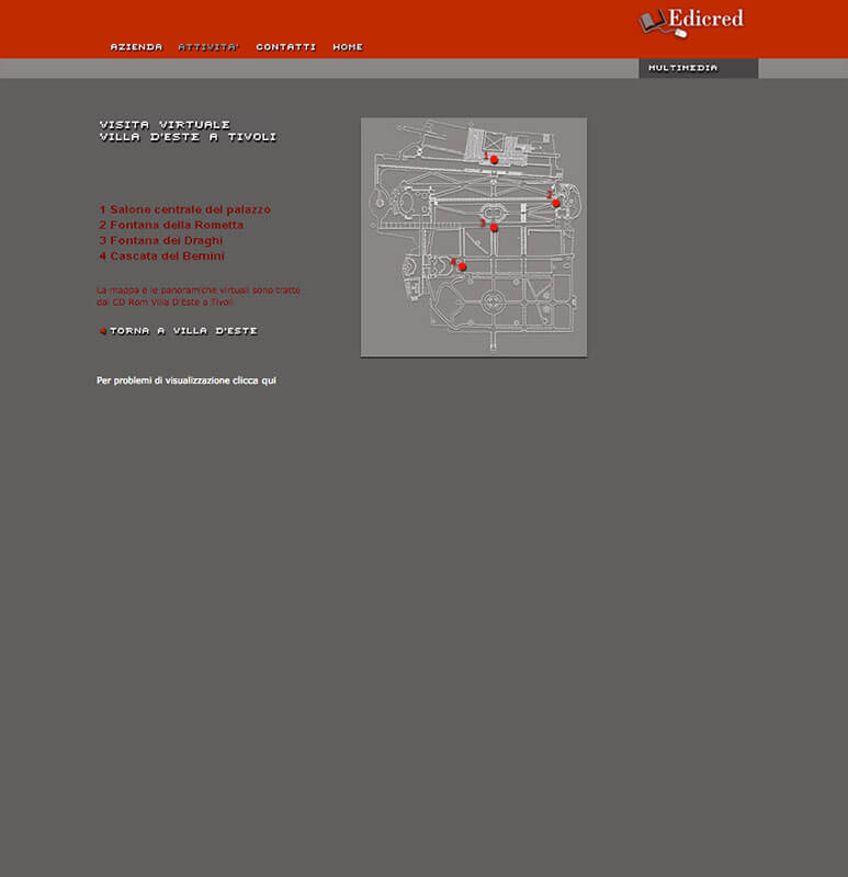
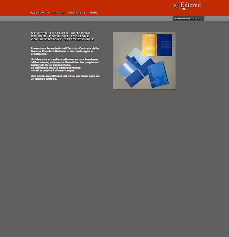
First of all, I tried to present Edicred’s offer in a complete way, highlighting the company’s ability to carry out a series of different activities, integrating tradition and innovation (paper+web+multimedia). The red chosen as the background immediately speaks of the strength of the brand. The intersection of the textures wants to talk about a system of “networked skills” and a strategic relationship with widespread professionalism. The color gray is juxtaposed with red to bring back towards the banking institution.
INTERFACE DESIGN:
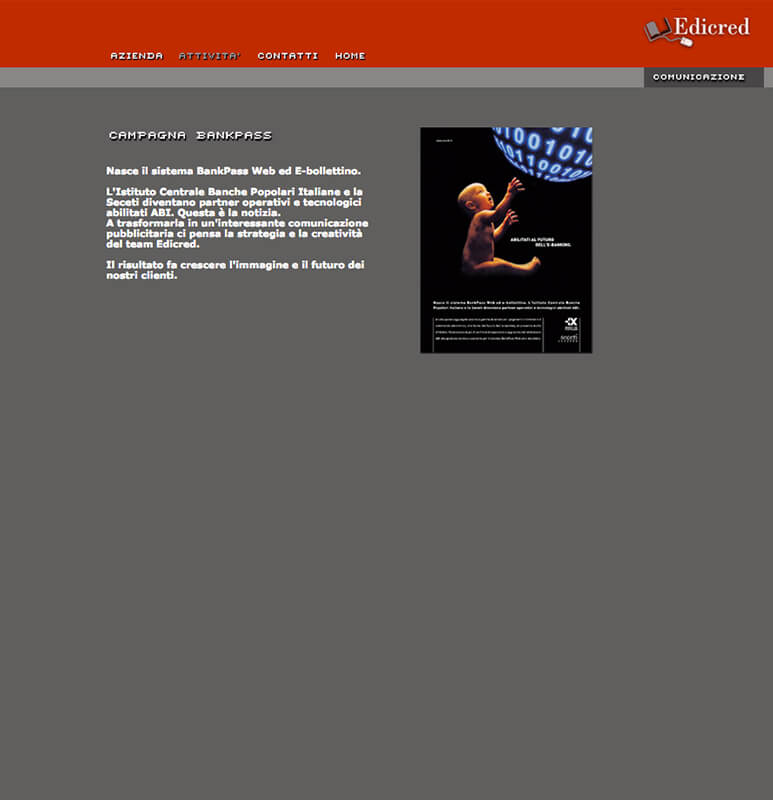
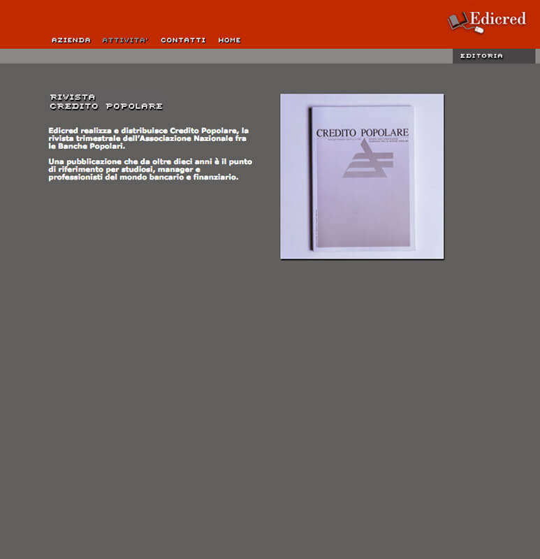
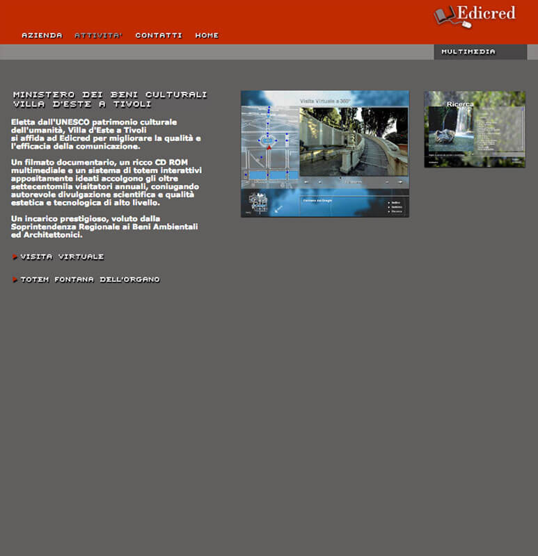
The interface is very simple and essential and leaves space for Edicred’s competencies. The navigation guides the user to get to know the company. We present Edicred as a flexible “project partner”, competent and able to integrate its services with those of its partners.
+CONCEPT:
The bar that contains the jobs in the index is in Flash by macromedia. At the time the software for animation. It contributed to a strong emotional impact and the possibility to see all Edicred projects.
