WEB DESIGN | FIRMA DIGITALE | B2B FINANCE SERVICES
CLIENT:
Seceti – Firma Digitale
Seceti is a company that creates and manages Information Technology and data transmission services for major Italian banks. Today it is part of the Nexi system, one of the systems and platforms for credit cards, debit cards and electronic payments.
BRIEF:
The website is dedicated to the digital signature and certification service for the security in the transmission of computer documents
The interface should be simple to use and make it easy for the user to complete the digital signature. The service was in its infancy and little known to the public.
ART DIRECTION:
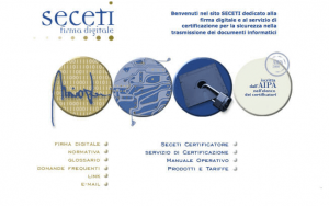
Starting with the logo, I extrapolated the main colors: blue and various shades. I combined a warm, reassuring, welcoming color, a beige for the menu. On the whole I wanted to convey a sober and institutional elegance. Some buttons are made in a three-dimensional way to emphasize the effect “touch”. the background color is white which gives order and freshness.
The photos are institutional although evocative. They are turned to blue and with rounded corners.
INTERFACE DESIGN:
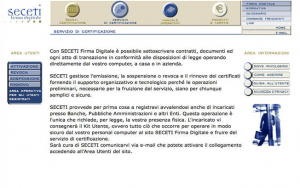
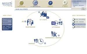
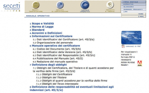
Help the user understand with ease. For this reason I thought to divide the interface in 3 areas. On the left the user area where to manage the operations once registered on the site. On the right the information area. On the top the menu of first and second level. It’s very important to visualize in an intuitive way the various phases from the registration to the renewal. For this reason I used some icons of common use inside an oval, numbering each phase.
In addition, in the information area there are four buttons with the most frequently asked questions.
+CONCEPT :
I tried to make something complex simple and usable.


